
Metaphors are often employed in interface design to help users learn the application by facilitating the transfer of existing knowledge. Some of the better-known interface metaphors include VisiCalc's ledger metaphor, the Desktop Metaphor first employed by Xerox, and Quicken's checkbook metaphor. Improperly applied metaphors, on the other hand, can detract from the usability of the application, as shown in the following examples.
Last updated 15-December-1999
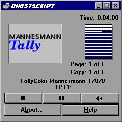
Manhaeve Hendrik sent us this image of the Mannesman Tally printer dialog. It is the first such dialog we've seen to utilize a VCR metaphor to control a printer. Hopefully, it will be the last such dialog we see. The Stop and Pause buttons, while not defensible, are at least somewhat understandable, but a Rewind button? As Manhaeve quipped, "What does this do, rewind the paper and erase what was already printed?"
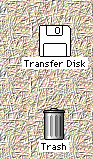
As a means of deleting files and documents, the Macintosh trashcan is a perfectly intuitive metaphor. Unfortunately, the designers decided to extend the trashcan metaphor to include the completely counterintuitive function of ejecting diskettes: drag an image of the diskette to the trashcan to eject it from the computer.
The Macintosh simply took the trashcan metaphor too far. They imbued the trashcan with magical powers that are completely incompatible with the established metaphorical association of deleting files. As a result, new users express anxiety and dismay at the metaphor, and even experienced users express reluctance to use the metaphor: "I don't want to delete the files on the diskette, I just want the computer to spit it out."
Watcom's C++ Editor provides a startling example of why metaphors are subject to basic principles of graphical interface design. Most notably, the metaphor must be apparent to the user, and the designer must include visual clues (or affordances) that will indicate the function of the metaphor.
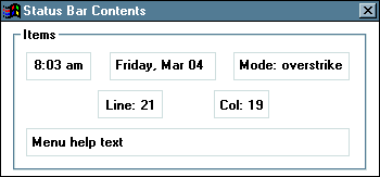
This window shown above is used to customize the application's status bar. Through the use of the familiar drag-and-drop metaphor, the user can specify the types of information to be displayed in the status bar, and the relative locations of that information. The user is expected to click on one of the boxes, then drag it to the appropriate location in the status bar. Unfortunately, the window provides no indication that this is so. The window is devoid of information, making it very unlikely that users will intuit the metaphor without resorting to the help file (access to which, by the way, is not provided from the window).
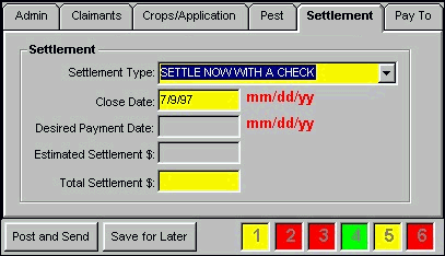
One of our visitors send us a collection of images illustrating the use of a Stoplight Metaphor as it was being used in an application at his company. He wanted to know if we considered it material for the Interface Hall of Fame or the Interface Hall of Shame. Well, here we are.
The "stoplights" are displayed in the lower right corner of the window. Their purpose is to indicate the user's progress while entering information in a complicated tabbed dialog box. Stoplight 1 relates to the first tab, Stoplight 2 relates to the second tab, and so on (anyone see a problem here?). The stoplight can be any of three colors:
| Yellow: | Some information has been entered on the tab |
| Red: | Not all required information has been entered |
| Green: | All required information has been entered |
While we found a number of problems with the general design of the form, there are some significant problems specifically related to the stoplight metaphor.
We would suggest the following as an alternative, which provides a single "Required Information Needed" indicator, physically proximate to the tab requiring information:

The Wizard Metaphor can be very useful for guiding a user through an infrequent or complex process. Unfortunately, many designers have erroneously exploited wizards as a means of making an application "easy-to-use", when in fact, they can make the application considerably more difficult to use.
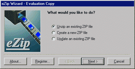
eZip Wizard by ediSys is one example of the misuse of the wizard approach to interface design. eZip is a utility to create, modify, and decompress Zip files, a process most internet travelers are very familiar with. Zip compression is essentially a file management process: the zip file is not unlike a folder, which contains one or more additional files. The user needs to open the Zip file and extract one or more files from it, or create a folder and add files to it, or remove files from an existing folder.
The problem with wizards in general, and with eZip in particular, is that they enforce a linear arrangement on the interface: the user must follow the steps the developer programmed into the application. This can be useful for the first-time or infrequent user, but can be oppressive to the experienced user. In eZip, these steps are defined as a fixed series of questions:
The user must respond to each question before proceeding to the next application-imposed step.
The first-time user may find the structure helpful, but the program's rigidity will soon be regarded as tedious. Users that frequently create or modify Zip files will find the structure unacceptable: even the relatively simple process of adding or removing a file becomes an interrogation.
Wizards should only be used for infrequently-used, complex processes, such as configuring a modem or partitioning a hard drive. Otherwise, they prohibit the user from controlling the application and give the appearance of treating the user as an idiot. As users, we don't like being treated like idiots, and will likely regard the application as 'stupid'.
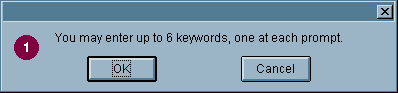
The Wizard Metaphor discussed above is based on a linear model of interaction, well demonstrated in this example of a database search provided in CompuServe's WinCim application. Compuserve offers a database of frequently asked questions, which can be searched via the use of keywords. As shown in the example, a simple search can require the user to interact with a surprisingly large number of dialogs, and requires the user to remember instructions shown very early in the sequence.
The linear metaphor is essentially an interrogation, and is regarded by many users as such. In this case, the task could have been easily accomplished in a single dialog, rather than the six disjoint dialogs shown. It is clearly evident that the programmers was considering only his or her programmatic requirements, and was blind to the needs of the user.
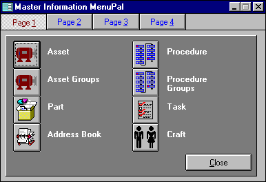
While most metaphors in interface design attempt to provide a basis on which the user can develop an appropriate model of the system's design, we have included this example as illustrative of the designer's mental model. We call this the Available Space Metaphor, and it describes how this individual approaches the task of adding functionality to an existing system.
This pseudo-tabbed dialog is used to provide user access to the various types of information in a complex system. Information types are arranged in accordance to the amount of available space on a particular pseudo-tab. When a psuedo-tab became full, the designer simply added another pseudo-tab, and added the new information types.
The tab labels have no relation to the information each contains, and further, there is no apparent grouping of information. "Tasks", for example, is located on "Page 1", whereas "Task Types" is located on "Page 3". The developer seems interested only in providing access to the functions, not in the degree to which that access might be meaningful to the user.
The tabbed dialog metaphor only works when the tabs contain related information. For situations in which the groupings are difficult to define, a simple alphabetized list of functions would have worked much better.
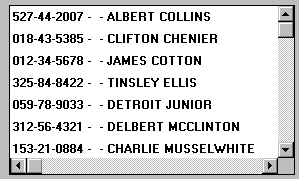
We found this unusual metaphor in Flexi, an accounting package for medium-sized businesses. We refer to it as the Magnifying Glass Metaphor since the listbox displays a magnified image of the selected item. Our guess is that the designers wanted to increase the likelihood that the user would be able to detect which item has been selected, but we would have thought that the bold blue border would have been sufficient for this purpose. The magnification is not only unnecessary, it makes the information more difficult to read.
Dan Weinlader sent in this image of a dialog from Socket Spy/32, a winsock trace utility. The dialog allows the user to set breakpoints to interrupt the program flow so that the user can better monitor the process.
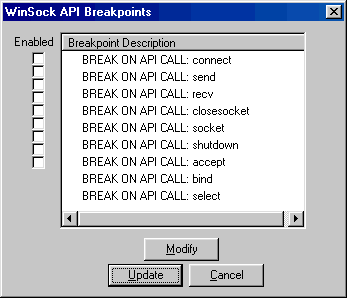
Aesthetically, the design reminds me of the "matched pairs" type of questions used in grade school, "Draw a line from the item on the left to its counterpart on the right." On a more technical level, I would have thought that a programmer sufficiently competent to develop a communications trace utility would have been sufficiently competent to know how to display checkboxes within a list, but since he or she was not, we can now add the Matched Pairs metaphor to our list of design strategies to be avoided.
(Sigh...)
Meet the animated paperclip, Microsoft's woefully inept attempt to provide interactive assistance in its Office97 applications. The paperclip is always on the screen, shifting about to let you know he's evaluating you as you compose a business letter, record your receipts in a ledger, or do whatever one does with a high-end productivity application. When you begin to perform a significant function, the paperclip jumps to life, raises his eyebrows, and dances about in the window. When you initiate an infrequently used function, the paperclip will interrupt you to ask if you want help.
My five-year-old niece loves the paperclip. Printing a page produces squeals of delight as the paperclip squeezes itself through rollers to illustrate the path of the page through the printer. That five-year-olds find the paperclip so cute should have been a clue to Microsoft that there might be some problems with the design: five-year-olds do not purchase $500.00 application suites; adults do, and most adults quickly tire of "cute".
The notion of interactive assistance is not the problem. Isys' founder was conducting research on interactive assistance as a graduate student nearly 15 years ago. The problem is that Microsoft's implementaion is intensely intrusive: the paperclip is incessantly animated, swaying about, moving its eyes, and even "jotting down notes". When it "speaks", you cannot help but listen. The user can turn it off, but only temporarily: the next time he or she tries to access the Help file, the paperclip again comes to life.
It would seem that the designers' enthusiasm for finally implementing interactive assistance clouded their ability to distinguish between the short-term "Wow!" first impressions and the more important extended-use reactions. Then again, this hypothesis is based on the dubious assumption that the marketing department even allowed testing to be performed.
A side note to Microsoft: a shifty-eyed character does not inspire much confidence and trust. Perhaps the "Puppy" agent would have been a better choice as the default.
Update (26-October-1998)
We are grateful to a visitor for pointing us to a recent article posted on CNN Interactive. In Microsoft Assistant Killed in Denver, it was reported that Microsoft program managers demonstrated a technique to kill the assistant to a crowd attending a development conference. As reported in the article:
The assistant, a paper clip with expressive eyes and hyperactive eyebrows that offers user tips, has been the source of wide scorn among developers, who have little use for its cuteness and intrusiveness. The assistant's demise triggered a hearty round of applause.
 |
 |
 |
|
 |
Whenever we are forced to used any of Microsoft's new applications, we cannot help but think of the 1957 comedy, "Desk Set", starring Spencer Tracy and Katherine Hepburn. Tracy played an efficiency expert with the unwelcome task of replacing the research department staff at a large corporation with a computer named "EMERAC". In an effort to engender maximum audience distaste for the computer, EMERAC was portrayed as a wall-sized panel of blinking lights, alarms, bells and whistles.
In evaluating interfaces, we now use the term The EMERAC Metaphor to refer to useless features that only serve to distract the user from the particular task at hand. As is amply demonstrated in the images above, Microsoft has made the EMERAC metaphor a central design theme in their applications. Such features provide absolutely no benefit for the user, and are only used to make the program look different, and perhaps, as a means of showing off one's programming abilities.
By now, you've probably scrolled the page down to hide the above animations. This should be a good indication that the EMERAC metaphor is not something worthy of emulation. Instead, we would recommend that you strive to employ the KISS Metaphor (Keep it Simple, Stupid). Your users will thank you.
Spidersoft's WebZip employs a particularly insidious metaphor in their list controls. As the cursor passes over items in the list, the color of the item changes to reflect, well...nothing other than the fact that the cursor is over the item. By itself, this is simply another example of the distracting EMERAC metaphor described above. Unfortunately, WebZip takes it one step further: if the cursor pauses for a moment, the item under the cursor is automatically selected; a mouseclick is not necessary.
The problem, as it is quickly discovered by using the control, is that the technique is subject to frequent inadvertent selection. Imagine having selected a file in the 'normal' way by clicking on it, then, as you move the cursor toward a menu item or command button, the phone rings, or you stop to consider which command applies. If this happens with WebZip, your selection will be deselected, and the item under the cursor at the time you paused will be selected instead. Since WebZip allows extended multiple selection, your series of complex movements to select several disjoint selections could be wiped out simply by pausing to think for a second.
Microsoft refers to the automatic selection of list items by pausing the cursor as a Hot Cursor. We were very surprised to find that the Hot Cursor Metaphor, along with the EMERAC-like coloring of list items, is built into the Win95 operating system: developers need only toggle specific settings in the control to enable these effects. Our hope is that few developers would want to degrade their applications by adding such useless special effects. They are distracting, cause the control to operate differently from similar controls, and can result in the computer's undo-ing the user's actions.
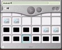
An extensive review of the user interface for Apple's QuickTime 4.0 Player can be found in the In-Depth section of the site. One aspect of the interface was particularly troubling: the Favourites Drawer, which is used to collect and provide access to the user's collection of multimedia files. As a file is added to the favourites collection, the application assigns an image to represent the file. As we pointed out in the review, the same image is used to represent all sound files, and a thumbnail of the first frame of the movie is used to represent movie files.
The QuickTime Player's drawer may be the first example of the Box of Chocolates Metaphor, based on the following quote from the movie Forest Gump:
Mama always said life is like a box of chocolates,
you never know what you are going to get.
The task of selecting a particular sound file is not unlike that of selecting a particular chocolate from a box of chocolates: since they all look alike, they only way to find the file of interest is to "bite" into several until you find the one you wanted. Selecting a particular movie follows the same process. Since a movie is identified in the QuickTime 4.0 Player by its first frame, and since the first frame of most movies is blank (especially movies provided by Apple), one cannot identify a movie from its image.
Instead of acknowledging this situation as a poorly designed interface, the chief designer for Apple's QuickTime 4.0 Player blames the content providers. Movie makers should make the first frame self-identifying, despite the fact that copyright laws in many countries specify that the first frame be reserved for copyright information. Similarly, but even more absurdly, producers of sound files, such as WAV and MIDI files should change the file format to include a representative image. Further, users who complained to Apple about this design were told to petition the content providers to change their file formats so that QuickTime could provide a meaningful way to identify the files. One would be hard-pressed to find a more definitive example of designer arrogance.
 Additional Sources of Information