
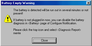
Frans de Haan sent in this image of a message provided my MTC Diag, a power management application that is provided with Saxum 8004 notebook computers. The intent of the message is to alert the user that the batteries are nearly depleted, but somehow, that message doesn't entirely come across to the user.
Abbagail Winters send along this image from BatchIt Pro. Despite the designer's attempts to organize the dialog, that organization may be entirely meaningless.
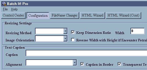
From the BatchIt Pro help file (emphasis added):
The Configuration screen is made up of 4 sections. They include Resizing Settings, Text Caption, Watermark and the Saving Option...Although this has nothing to do with Resizing, the Image Orientation option allows to do a mass rotation of all the images...
Owen Rudge sent in this bizarre message from Microsoft's Outlook Express 5.0:
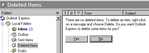
I was using Microsoft Outlook Express 5 and I went into the Deleted Items. To my surprise I found a message stating that there were no items in the Deleted Items folder and do I want OE to delete something. What sort of a message is that?!? Why would I want OE to delete a randomly-selected piece of mail? I didn't try and find out what it would delete, I just pressed No immediately!
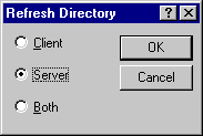
Bo Bichel Nørbæk discovered this dialog in Reflection FTP after hitting the F5 key to refresh the file listings. Understandably, Bo asks: "WHY THE #%&?# CAN'T REFLECTION JUST GO AHEAD AND REFRESH BOTH LISTINGS INSTEAD OF PUTTING UP THIS STUPID DIALOG BOX?!!!"
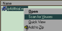
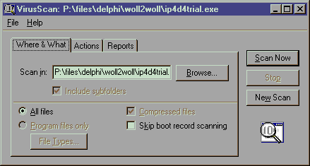
Ken Rachynski asks a similar question of Network Associates' VirusScan. The program adds an item to Explorer's context menu to allow the user to scan the selected file or folder. However, rather than performing the scan, the application pops up a dialog box asking if the user wants to Scan Now?
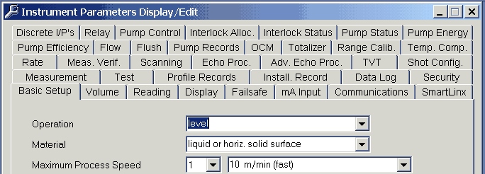
An anonymous visitor sent in this image from Milltronics' Dolphin Plus, a configuration package for industrial level and flow sensors, as a candidate for the Tabbed Dialog Hall of Shame:
Where's Waldo?
Ben Oram sent in this image from English-German from OneApp Software.
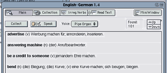
The image reveals a number of interface problems related to the program's failure to adopt the MacOS interface design guidelines, but one in particular is worthy of special mention. The purpose of the dialog is to display a list of matches for a given word, yet despite the number of matches (101 in this case), the program does not display a scroll bar. Instead, the program employs a custom control comprised of Up and Down buttons, and a tiny "speck" to indicate the user's relative position in the list.
When one considers the amount of functionality provided by a standard scroll bar, the decision to replace it with a far less functional custom control is particularly shameful. In addition to being able to scroll up and down a line at a time, a standard scroll bar also allows the user to page up and down, and to grab the scroll indicator and drag it to the desired position. Further, the standard scroll indicator is far more visible and indicative than what appears to be nothing more than a few misplaced pixels.
It would appear that Microsoft's Artificial Intelligence Division has
been at it again. Pierre sent in this image of the web
page he received when he visited http://www.microsoft.com/ie:
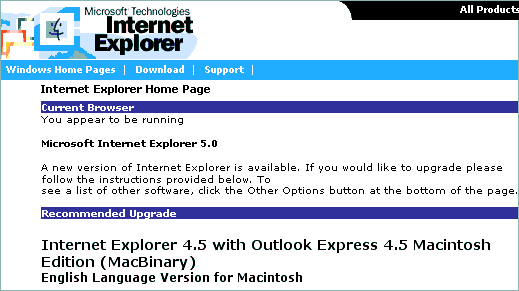
Could this be a realization that IE4.5 is somewhat better than IE5.0?
PointCast, one of the first "push" systems that "spread like wildfire" several years ago has been replaced with a new version. In a detailed guest analysis of the replacement, visitor Bill Tyler concludes that the replacement is an inferior tool whose presentation, GUI and features that are a major regression --not improvement.
Rick Lamoreaux sent in this image he received when attempting to add files to a project in Microsoft's Visual Source Safe.
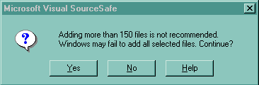
As Rick pointed out, the message does not inspire much confidence in the software, and seems to be not so much a warning as a CYA hedge just in case something goes wrong. The message, "This might not work, are you sure?", seems to be a means of transferring responsibility for the program's failure to the user.
Gary Walker received the following message after accidentally deleting several lines in Microsoft's SQL Server 6.5 -- Enterprise Manager.
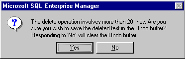
If you select more than 20 lines of text from the query window, and then accidentally hit delete, you get this apparently helpful error message, so that if you change you mind, you can hit "No" to avoid the delete. However, closer inspection of the message reveals a glaring inconsistency. Hitting "No" actually causes the Delete operation to continue, but destroys the Undo buffer in the process, leaving no means of canceling an accidental delete.
Søren Erland Vestø sent in this image he received from the otherwise excellent freeware hex-editor A.X.E.:
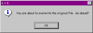
Søren received the message upon accidentally saving (via CTRL-S) a document he had opened but not edited. Beyond the fact that the dialog providers no means for the user to convey, "No it's not OK", one has to wonder why the message exists at all.
When installing Office 2000 recently, David Nottage discovered that Microsoft's developers still haven't learned how to write a meaningful error message:
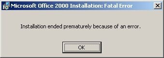
The message is entirely unhelpful, giving no indication of what the error is, what to do to solve it, or even the location of an error log if one existed.
Welcome to Windows David.
Steve Dieke sent in this image illustrating the Minimalist school of tab design used in Novell GroupWise 5.1:
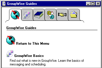
In addition to the disconcerting lack of Gestault, the design suffers from a number of other important problems. Most notably, the pictures on the tabs make little sense. Recognizing this, the developers felt compelled to add a glossary tab (shown) merely to provide an explantion of the images. Unfortunately, if you have moved off of the glossary tab, you lose the explanations. While tooltips should not be considered an appropriate solution to the use of unclear icons, they certainly would have helped here, if Novell had thought to provide them. Better yet, textual labels would have negated the need for a glossary and tooltips.
Timothy Tan discovered the following catch-22 in Microsoft's Word 97. When doing a spell check for a document set with the language as "English (British)", the spell check informed him that the word "worldwide" is not in the dictionary and offered to change it to "world-wide".
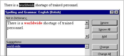
Tim accepted the application's offer to change the offending word, only to find that Word 97's grammer checker considers the word "world-wide" to be a compound word that would be better written as "worldwide".
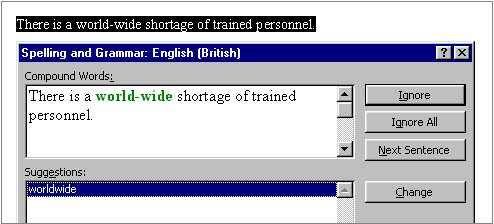
Tim discovered that the only way to solve the problem is to add the word "worldwide" to the custom dictionary, or use the "English (American)" dictionary.
Greg Funk sent in this rather perplexing problem he discovered with Microsoft's Internet Explorer 5.0 FTP application:
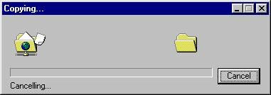
The problem is one that could keep the more philosophically-minded computer users debating at great length: What happens when one cancels the operation Cancelling [sic]? Greg points out that the scenario can be recreated in the following manner:
It should be noted that the operating is not canceled when requested. Greg eventually had to hit the close button in the upper right corner. In his own words, Greg "canceled out of canceling the canceling by hitting the close box."
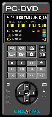
Of all the possible real-world objects that one could select as the basis on which to model a software user interface, I do not believe that one could make a more ill-advised decision than to select a hand-held remote control. Unfortunately, Creative Labs did just that with their design of their Creative PC-DVD application.
Visitor Ilari Sani sent along images and a thoughtful critique of the resultant design, which provides further additional evidence why the software industry should adopt a zero-tolerance policy against the use of real-world metaphors.
Additional detailed critiques of real-world interface metaphors in the Hall of Shame include:
These reviews reveal a number of important axioms for those contemplating a real-world design metaphor:
Just say No to real-world metaphors.
Zing Zing Awungshi Shishak suggested that I take a look at Yamaha's SoundVQ player as a potential candidate for the Interface Hall of Shame. I didn't bother to look much farther than their Open File dialog, a portion of which is displayed here.
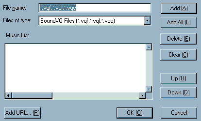
Have any of the SoundVQ developers ever seen a Windows application?
Tom Campbell received the following message while trying to check out and edit a file in Revision Master.
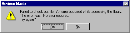
As Tom quipped:
In an odd way, such a self-contradicting message is conceptually artistic. There is tension between the two different spellings of "occurred." And an error message stating there's no error has a zen symmetry that's at once perplexing and graceful.
Jean-Marc Orliaguet provided evidence that messages warning of success are not restricted to the Windows operating system. The following message was generated by the NetInfo configuration program running on the Mac OS X Server.
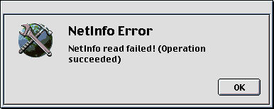
The only real difference between the message on the two operating systems is that the Mac OS X server feels that it must convey a much greater sense of urgency and alarm!
Søren Vestø found the following problem when trying to install the Microsoft Developer Network.
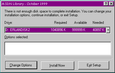
The problem is that the display of Available Memory maxes out at 999999K, even though Søren swears that there was 2.4 GB available. Interestingly, despite the fact that the program has concluded there is not enough memory, it allows the user to proceed, successfully, in fact.
Rich Adams was understandably full of questions when trying to uninstall ICQ.
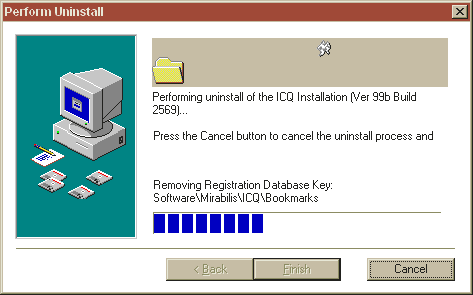
And....order a pizza? Reformat the hard drive? What?
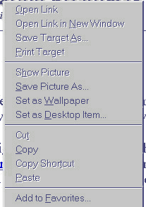
Eric Hartwell highlights a notable problem with the design of the context menus Internet Explorer. Eric often avails himself of the 'Save Image As' menu item to copy images from web sites. Unfortunately, the 'Set as Wallpaper' menu item is located immediately below the desired menu item, making it a likely inadvertent target. The problem is that 'Set as Wallpaper' acts immediately and irreversibly; the application does not first prompt the user, as is the case with the menu items immediately before and after it, so there is no way to cancel the action. If the 'Set as Wallpaper' item is inadvertently selected, the user will have to go somewhere else and perform a series of actions to undo the effects of the unintended action.
This wonderful example of bad design was contained in the tutorial for Mosaix, a customer support application popular with mega-corporations:
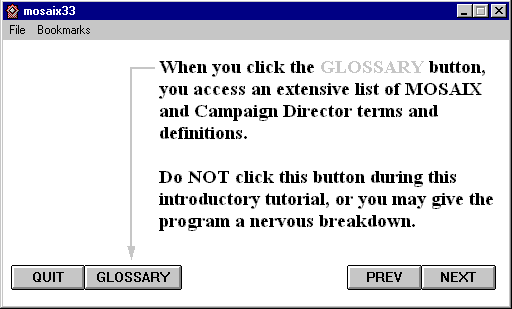
A competent developer might have recognized the absurdity of the message and simply disabled the offending 'Glossary' button. The tutorial however, does not appear to be the product of the Mosaix development team. Rather, it appears to be the product of MediaPros, a company specializing in computer-based tutorial design, as indicated in this success story posted on the company's website. With an opening message like this, MediaPros may want to reconsider the tutorial as an example of their design abilities.
Richard Sheridan provided a couple of images illustrating some further evidence against the use of real-world metaphors in interface design. Both images come from AudioRack 32, a multimedia application packaged with his Hewlett-Packard computer.
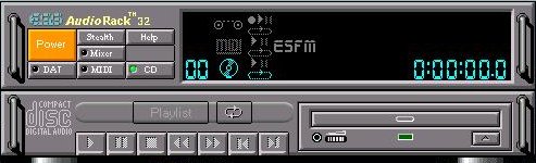
... like IBM's "Real CD", Audiorack actually looks like a CD-Player, and is hideously incongruous in the subtle, soothing Windows environment, like someone turning up dressed like Big Bird to a formal dinner. Yet, since the designers seem obsessed with the form itself, let's be fussy: it's odd that there is an ugly space next to the "Mixer" button. What else? I particularly like the button called "Stealth". Everyone else on the planet would call this "Minimize", and it would be placed top right-hand of the form. In fact, the tooltip does say, "Enter miniature mode". Then note all the cute LCD symbols on the display panel. Any idea what they mean? Who cares?
The second image was even more revealing. AudioRack 32 used its own custom "Rack Control" to allow the user to scroll through additional controls that are as yet hidden from the user:
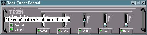
As Richard noted, the Rack Control seems specifically designed by very artistic people to prevent easy usage. Richard had no idea that other controls were available; he discovered the "feature" when he accidentally left the mouse cursor over one of the "handles".
Martin "Jay" Sundstrøm sent in a couple of images indicating localization problems with the Danish version of the MacOS 8.6 operating system.
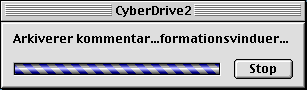
The OS wanted to say "Arkiverer kommentarer i informationsvinduer" (Saving comments in info-windows), but by not providing adequate space, the designer of the window gagged the OS before the message could be completed.
When attempting to restart the OS, Danish users are presented with the following message:
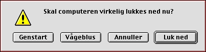
In English-language versions of the OS, the user can press the "R" key on the keyboard as a shortcut for the "Restart" button. Unfortunately, Danish users as well must use the "R" key as a shortcut for restart, despite the fact that the Danish word for Restart is "Genstart".
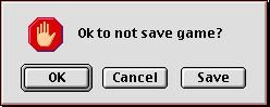
Chris Kostiw sent in this image, taken from the Mac shareware version of Risk. The image is displayed if the user attempts to quit the game without saving. The Mac UI guidelines eshcew the use of Yes and No responses in dialogs; here's why Apple should change the guidelines:
James "Kibo" Parry sent in this image taken from Apple's SimpleText. The dialog thoughtfully provides a text box into which the user can type a search term, but before he or she can use the search box, it must first be unlocked, by clicking the arrow button.
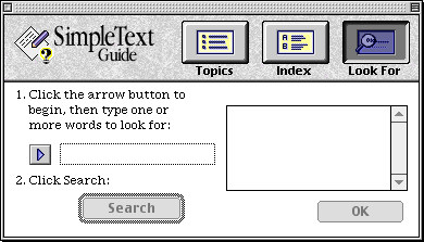
It would appear that the designer felt that the user must be protected from accidentally entering text in the search box.
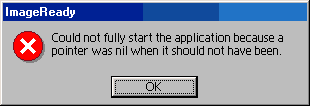
This example of meaningless GeekSpeak was discovered in Adobe's ImageReady by Joanna Southerland:
Avery Lee sent in this image provided by Intel's VTune 4.0 performance tuning tool. Avery discovered the message when he I tried to invoke the 'code coach' on an assembly language file, only to discover that VTune only understands C/C++, Java, and Fortran:
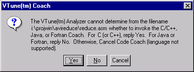
Somehow, the developer's inability or unwillingness to design an appropriate dialog box doesn't inspire a great deal of confidence in his or her ability to perform performance tuning.
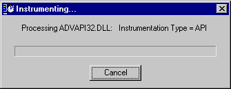
VTune provides another example of questionable competence in its non-progress dialog, as shown in the following animation:
Michael Wilson sent in this example of programmer verbosity that he was confronted with when he tried to view Midwest Microwave's online catalog at http://www.midwest-microwave.ltd.uk/index.htm.
One has to wonder why all that information was loaded into a transitory message box rather than simply including it on the web page itself.
James "Kibo" Parry sent in an image of an error message he received when trying to register with American Airlines' Web site:
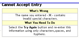
Kibo simply typed "W." (not ".W." and not "-.W.-") when asked for his middle initial. Apparently, either the "W" or the "." is considered an "invalid special character". Kibo didn't realize that he could only type "characters".

It would appear that Apple has reconsidered its design of the user interface for the QuickTime 4.0 Player. Steve Jobs revealed the new interface during his recent MacWorld presentation. As can be seen in the image, a number of the "features" critiqued in our original review of the QT Player Interface have been deservedly discarded. Most notably, the volume "thumbwheel" has been replaced with a vastly more appropriate slider control, the "Play" button no longer appears to be on steroids, and the designers have reconsidered their earlier classification of "fast-forward" and "reverse" as advanced controls. While it is not clear from the static image of the the interface, it does appear that Apple may have taken my suggestion that they burn the source code to the "Favorites Drawer". Finally, since the designers are no longer hell-bent on making the application look like a Walkman, they allowed themselves to provide the standard window-management controls. Unfortunately, rather than provide meaningful icons to hint at the underlying functionality, the MacOS X designers concluded that Strawberry-, Tangerine-, Lime-, and Grape-colored droplets would suffice. For the uninitiated the general consensus seems to be as follows:
Strawberry Close Tangerine Minimize Lime Maximize Grape "Single Window" Mode
For the many individuals out there with color vision impairments:
Left-most Droplet Close Second Droplet from Left Minimize Third Droplet from Left Maximize Right-most Droplet "Single Window" Mode
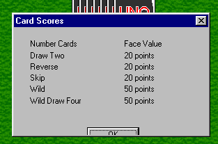
I'm beginning to feel that I need to add a new section to the site entitled: "Think Ahead". Chad Lowry sent in this image of a dialog he was presented during a game of Uno. It is clear evidence that yes, it may be too much to expect that developers would take a moment to look at what they have programmed.
Jeff Howser sent in this image of a dialog he discovered in a program called Traffic Office Manager.
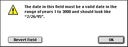
Whereas most of us have been concerned with the Y2K problem, it would appear that the developers of this application were somewhat forward thinking. But I have to wonder, does "2/26/95" represent February 26th 1895, 1995, 2095, or 2995?
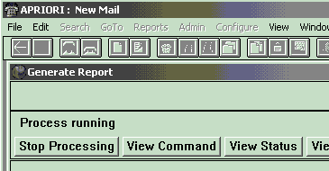
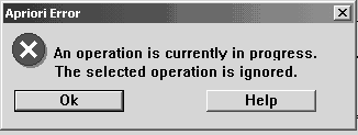
Adam Peterson send in two images to illustrate the "In Your Face" design metaphor employed in the program Apriori. During the report generation process, the application offers a "Stop Processing" button, perhaps to allow the user to ... stop the processsing of the report.
When the user presses the Stop Processing button, well...
Patrick McClimans discovered another example of the "In Your Face" design metaphor in the SARC Intelligent Updater, Norton's utility for updating anti-virus definitions:
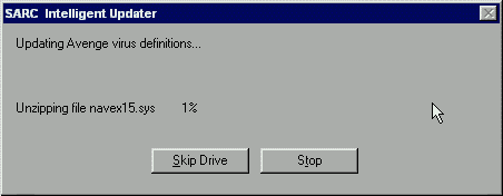
According to Patrick:
I attempted to stop it while it was processing, and the program gave me this snippy response. I felt like giving it the old CTRL-ALT-DEL and saying, "No, you'll stop when I SAY you'll stop."
A further variant of the "In Your Face" school of design can be found in the Windows98 Explorer:
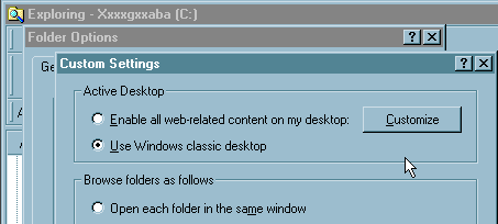
Unlike the Options dialog provided in the Windows95 Explorer, the Options dialog in the Windows98 Explorer really does provide options. One such provision, strangely enough, is the ability to customize the desktop. However, when the "Customize" button is clicked, the user is asked if he or she would rather view the Customize Desktop options instead. Excuse me?!!!.
By the way, the message is displayed whether or not the user has made changes to the Folder Options dialog.
A final variant of the "In Your Face" school of design can be found in the latest version of Jasc's Paint Shop Pro (v. 6.0):
In its default configuration, users of the new version find themselves in a game of tag with the interface. PSP's tool palettes have been given the magical ability to be visible only when the cursor passes overhead; when the cursor moves outside of the palette, the palette size is reduced in both height and width.
One notable implication of the design is that the user must engage in an idiotic game of tag to get rid of the offensive palette. The position of its close button can vary by several inches between the palette's open and closed states. If the user overshoots the close button, its position will again change, causing the user to again make a substantial mouse movement to open the palette, just so that he or she can again try to close it for good.
The IHOS takes a look at uninstall programs, with an in-depth look at the uninstaller for Headlight Software's GetRight. Every developer should take a similar look at the degree to which his or her uninstaller satisfies its functional requirements.
Dominic Start sent in this image of an error message he received when attempting to save changes in Microsoft's SQL Server 7:
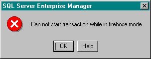
After extensively searching Microsoft's documentation, Domenic finally discovered the true meaning of the message: 'The connection had been lost but SQL Server had re-connected.'
To add to the mystery, Adam Wilkinson sent a note that he discovered the same message while working in Microsoft's Visual Basic:
We also got that message from VB when you try to write to a forward only/read only recordset. The firehose mode in that case means that you are only able to get records in the order they are sent, no backtracking, or writing to the recordset. It makes a little more sense in that context, but it still had us laughing and wondering what the hell that was supposed to mean...
Since its inception, I have considered Microsoft's practice of combining program installation and removal functions into a single program to be inadvisable. The awkwardness of the practice is clearly illustrated in the uninstallation progress dialog used in the Windows NT Option Pack:
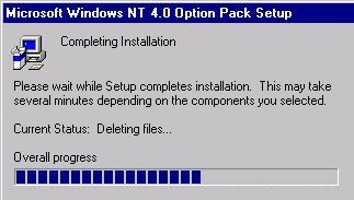
As pointed out by visitor Adrian Cole, the dialog makes repeated references to the installation of the product, and barely mentions the fact that the program is being removed.
Then again, is having to run "Setup" to uninstall a program any less discordant than having to click "Start" to exit Windows?
Speaking of installation programs, James Lynn shared his very justified opinion of installation wizards that provide an iconic command button to start the installation, in addition to textual command buttons to perform other functions. The following example is from the installation program for Microsoft's Data Access 2.1:
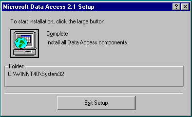
The very fact that the designer added not merely one but several instructions to the dialog should be taken as an indication that the dialog is poorly designed. One can only surmise that the instructions were added because users (myself included) often failed to recognize that the image represented "Begin". Unfortunately, the instructions are themselves poorly designed: the Exit button is significantly larger than the referenced button.
Unfortunately, the installation kits currently provided in Microsoft's development tools also utlize the "Which large button?" design. Perhaps Microsoft figured that if the design were inflicted on enough people often enough, the design would eventually become less obtuse. I would have guessed that a button simply labelled "Begin" would have been clear enough, even without specific instructions.
Michael Keller tipped us to a truly awful design strategy used on the "Student Section" of the University of Tulsa website.
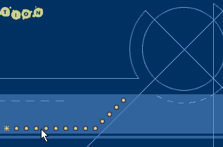
Links to the various sections of the site are represented merely as "dots" that measure 7 x 7 pixels in size. The meaning of the dots can only be discovered by placing the mouse pointer over each image and reading the resulting rollover description. Beyond the fact that there are no labels to represent the links, the diminutive size of the images, their proximity to each other, and the number of images, taken together, guarantee that the user will have an extremely difficult time attempting to locate and navigate to a desired link.
The designers themselves recognized that the design was problematic. In order to mitigate the most serious problem, the fact that visitors never even noticed that the dots were links, an animated instruction was added to the page: "mouse ... over ... dots". In the text-only version of the page, the designers referred to the dot-based design as "Funky". Another word comes to mind that more accurately describes the design: Pitiful.
Jordan McClure sent along some images illustrating the dubious use of scrollbars in PVCS Tracker, a configuration management utility:
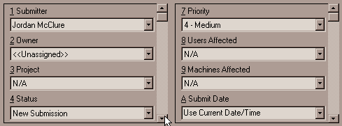
The image may need some explanation. The image represents a portion of a dialog used to create a report. Report parameters are entered through the use of drop-down controls, numbered, or rather labeled 1 through ... B. Unfortunately, the designer elected to present the controls in two separate lists, each scrolling independently of the other, despite the fact that conceptually, there is only one list.
The labeling demonstrates another equally unacceptable practice: the numerical and pseudo-numeric labeling of controls. The reason that the controls have sequential labeling is that such labels make it easy for the designer to assign unique mnemonic characters to provide keyboard access to each control. The designer's laziness however, has an unfortunate and unwanted effect on the user: sequential labels lead the user to conclude that the fields themselves are sequentially related. The user is likely to conclude that he or she must navigate among the fields in the specified order, and may be more likely to conclude that a response is required for each field. One serious drawback to the use of sequential labels is that should a need arise to add, remove, or reposition a field in a future version of the program, the mnemonics associated with the remaining fields will necessarily change. Users that have become accustomed to the mnemonic ALT+4 to access the Status field in version 1.0 of the product, for example, may find that ALT+4 in version 2.0 accesses the Priority field.
Sequential labels are a cop-out, used only to make things easy for the designer.
Todd Hensley described yet another IBM-esque interface solution, this time with Lotus Approach.
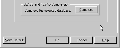
To compress a database in Lotus Approach, the user must then select the "Database" tab from the dialog that appears after selecting File -> User Setup -> Approach Preferences. Let's put aside for the moment the fact that few users would ever intuit that path as the means to locate a basic database maintenance function. The more problematic aspect of this process is that after the user has finally located the function, the interface design will lead the user to believe that the function will not work.
The user is presented a standard command button with the label, "Compress". However, when the user clicks on the button, it takes on a disabled appearance. Todd explained that he sat looking at the button for a while, believing that his database was being compressed. After some time, Todd realized that there was no noticeable disk activity during this time, and on a whim, he hit the OK button at the bottom of the dialog. In so doing, Todd discovered the actual design of the dialog.
In this example, Lotus has changed the behavior of the standard command button so that it operates as a toggle, much like a checkbox. This in itself is bad enough, but Lotus managed to make it even worse: unlike a checkbox, there is no way to un-toggle the Compress command button. Once clicked, the only way to indicate that you do not wish to compress the database is to Cancel the dialog.
Hugo Russell provided the following image from Continuus, a source-code control application. The image shows a particularly nasty dialog for building a query in the source code database.
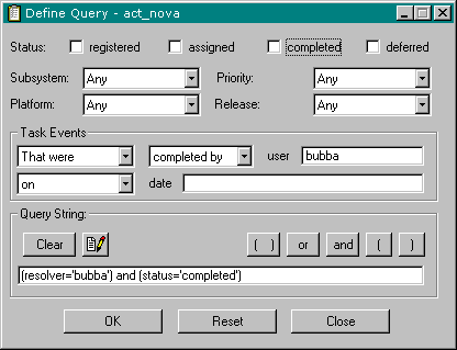
The most egregious aspect of the dialog is its bizarre use of checkboxes, whose standard behavior was changed so that they would operate like command buttons. When the user clicks on one of the checkboxes, a clause is added to the query string at the bottom of the dialog. However, the program immediately unchecks the checkbox, leaving the user no means of undo'ing the action. If the user were to click the checkbox again, attempting to set it to the "checked" state, the clause would be repeated in the query string.
Amit Schreiber sent in this image of the About Box in Microsoft's Internet Explorer 5.0, after numerous patches from Microsoft had been applied:
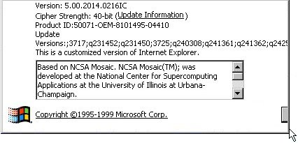
Microsoft seems to have adopted a strategy of recording each patch on the About Box, separating each patch identifier with a semicolon. Perhaps because this is the 5th major release of the product, the developers didn't expect it to need many patches, and therefore didn't devote much screen real estate for the recording of patch information. Oops!
That gray thing in the lower right-hand corner? Oh, that's the OK button. For some reason, the developer seems to have associated its placement with the width of the patch identifier information. If Amit were to receive just one more patch to the program, he can kiss the OK button goodbye.
Of course, Microsoft is not alone in the failure to properly display long file names. Per Lindström sent in this image of a potentially important message from Netscape Communicator:
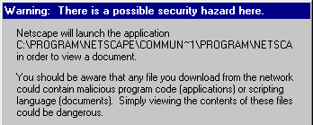
If it were important to tell the user the name of the program, then it might be worth the effort to make sure you provide enough room to display the name of the program. This failure in this case is especially notable considering that the program appears to be located in the default path Netscape created during the installation.
An anonymous visitor sent in a screen shot, a portion of which is shown here, from RMS Systems' PC Compliance MSDS Management Software. The program is intended to allow the user to easily manage Material Safety Data Sheets, those important pieces of paper that describe the physical and health hazards of chemicals used in the workplace, and describe what to do in case of an emergency.
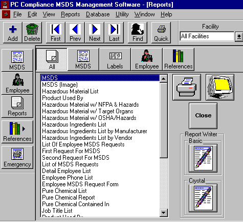
One would have expected that an application intended to provide information to deal with emergency situations would be designed to make the retrieval of that information as efficient as possible. The images used on the buttons in this example serve little purpose beyond that of confusing the user. The interface is plagued by duplicate toolbars, the use of the same image for different functions, the use of different images for the same functions, the use of group boxes around a single button (?!), and an almost overwhelming sense of disorganization.
Note to GUI design instructors and professors: PC Compliance MSDS Management Software would provide an excellent case study to demonstrate GUI design problems to your classes. A demo is allegedly available from the site at http://www.rmssystems.com/, but repeated attempts to access the demo were met with failure.
Someday I hope to add a new section to the site devoted entirely to the design of toolbars. In the meantime, enjoy the following, sent in from an anonymous visitor, from a program described as "Lotus Notes, hacked beyond recognition into a bastardized app called StarNotes".
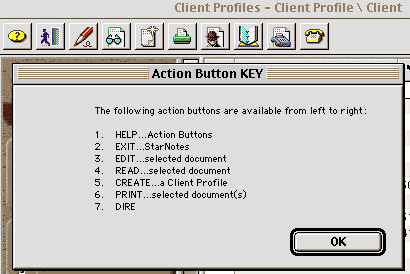
The "Action Button KEY" window appears upon clicking the Help button on the toolbar (referred to in the window as the #1 button). The absurdity of the "KEY" is that the user must count the position of the button of interest, and map it to the number in the KEY.
To the StarNotes developers, I offer the following advice: nothing helps describe a picture more than the picture itself.
Steve Brickman sent along a screen print of the registration interface used in Psychedelic Screen Saver:
In this example, the command buttons are used to specify options. The user navigates through a "Wizard" by clicking on a command button to make a selection, then by clicking the Next command button to initiate the selected function. This process is repeated a number of times depending on the selections, causing a variety of command button matrices to be displayed.
OK, here's the rule: command buttons are used to ... issue commands. If you want the user to specify a selection, use selection controls, such as option buttons, checkboxes, or list boxes. If you forget this basic rule, the command buttons in your application will operate unlike the command buttons in every other application, with the notable exception of course, of Psychedelic Screen Saver.
Visitor Stefan Buj sent in this image from the References dialog in Microsoft's Visual Basic.
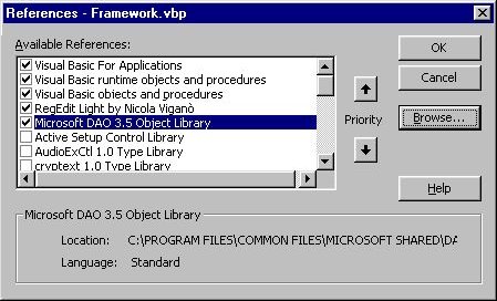
As the user clicks on any of the references, its associated filename is displayed in the lower portion of the window. Unfortunately, Microsoft failed to provide enough room in the window to show the file name. Some might argue that the developer cannot always anticipate the convoluted paths users may choose to place their files. In this case however, the convoluted and lengthy path was created by Microsoft.
If you consider something important enough to to be displayed on the screen, you should make sure that it is indeed displayed on the screen.
Visitor Avery Lee suggested the program Full Motion Video as a candidate for the Interface Hall of Shame, based largely on one notable feature of the program: a single menu:

One can only surmise that the developer simply wasn't comfortable with the menu editing capabilities of his development environment. We'll call this the Windows95 Start Menu Metaphor: a single menu (not surprisingly labeled "Menu"), which itself consists of a large number of cascading submenus. Breaking the submenus out into separate menus that would provide rapid access to such features as "Help" did not seem to be a concern to the developer.
"Full Motion" may not be merely a name for the application, but may very well describe the developers' philosophy. When the user first loads the program, and until a movie is actually loaded, the user is subjected to the following animation:

Unfortunately, right-clicking as instructed doesn't help all that much. The user is then presented with the exact same supermenu one finds under the Menu menu. Gee, thanks.
Quite a number of visitors have suggested over the past few years that SupportMagic be added to the Interface Hall of Shame. Wil Johnson was the first to include a number of screen shots illustrating a variety of reasons why. A number of the images were deserving of immediate entry into the Hall of Shame:
Despite the hundreds of design failures described in the Interface Hall of Shame, I would be hard pressed to find a more ill-advised design strategy than SupportMagic's use of the title bar as a container for dialog-specific command buttons. Microsoft may have contributed to this strategy by placing the window-management controls in the title bar in the form of tiny command buttons. The inadvisability of Microsoft's approach has been clearly evident since the release of Windows95: we have all minimized applications we intended to maximize, hit the restore button when we intended to maximize an application, or even closed an application when we wanted to maximize it. Initially, Microsoft limited the title bar buttons to window management controls; at some point they inadvisedly added the Help button to the title bar of certain dialogs. SupportMagic may have incorrectly taken this as impetus for adding whatever buttons they wanted to the title bar. As yet, I have not uncovered their criteria for determining which controls get placed in the title bar and which get placed in the standard location, nor have I discovered the rationale for determining which dialogs will have their OK and Cancel buttons placed in the title bar, and which will have their OK and Cancel buttons placed in the standard location. Placing command buttons in the title bar is a truly bad idea that will guarantee that your application will suffer from usability problems.
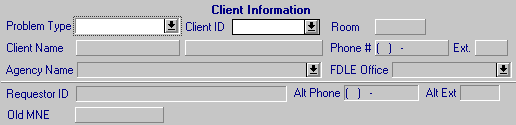
This image represents a small portion of the main text-entry dialog of SupportMagic and suggests that the product might be more appropriately named SupportMystery. Any user first encountering such a dialog would be at a loss as to how to interpret the design of the form. Certain fields are recessed, others are raised, text entry fields may be either recessed or raised, and when raised, take on the appearance of blank command buttons. Sometimes, different borders are used for similar information: whereas the Phone Number field is raised, the Alt Phone field is recessed. The background color of all controls, except for the drop-down boxes (which the programmers could not modify), is the same as the background of the form. By industry convention, this indicates that the controls are read-only. In SupportMagic however, this merely indicates that the designers/developers are not familiar with industry conventions.
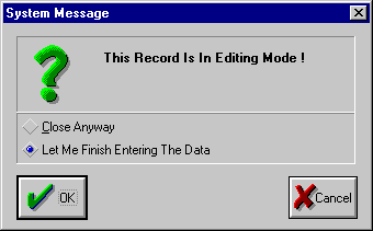
When the user attempts to close the problem entry dialog without saving, rather than providing a typical confirmation dialog ("Are you sure...?"), SupportMagic lashes out at the user, shouting that the program is in "Editing Mode" (as if that is somehow significant). There is no excuse for a program to assume such an attitude; any potential atmosphere of cooperation between the program and the user is lost.
Moreover, while the purpose of the dialog is to confirm whether or not the user wishes to cancel the previous dialog, the unique design of the dialog completely belies this purpose. The Cancel button, the most visible object in the dialog, is useless, as the user must first make his intentions known through the use of the (notably uniquely designed) option buttons. To indicate that you indeed wish to discard the previous edits, you must first select "Close Anyway", then click the OK Button. To indicate that you did not intend to discard the previous edits, you must first select "Let me finish entering the data" (Let me?), then click the OK button.
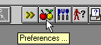
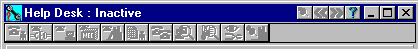
This is just too darned funny. This animation was derived from one of SupportMagic's many toolbars. The "fruit" toolbar icon provides access to the application's Preferences dialog (as if that really needs to take up space on a toolbar), and, of all things, the "flatware" icon is used to check if a person is available before transferring work to them.
SupportMagic is purported to be one of the leading help desk software systems. If that is indeed true, it may help explain why it's so difficult to get good technical support nowadays...
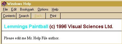
Lisa Carter sent us this image from the game Lemmings Paintball. The image clearly illustrates the fact that QA testing should include both the application and its supporting documentation.
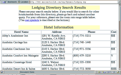
Carl Fink sent us this image he received while planning a trip with the online Amoco Motor Club. The site allows you to search AMC's database for a hotel at your destination; unfortunately, your search cannot be any more specific than the State of your destination. While planning a trip to California, Carl was rewarded with a listing of all 630 participating hotels in the State of California, which required Carl to then wade through the list to find a hotel in his destination city. If the site's designers had actually tried to perform a search as an AMC member would, they might realize that a a finer grain of analysis might be warranted.
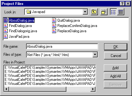
Bob Florian described the "Project Files" dialog of Symantec's Visual Cafe as being one of the worst engineered interfaces he had (yet) encountered. The dialog is used to add and remove source files from a project. The upper half of the image closely resembles the uncommon file dialog in Windows95, and the lower half lists the files comprising the current project. The resemblence to the Win95 dialogs however, creates a problem for the user:
When you use this dialog the natural tendency is to select the file or files you want to add with the file selection controls and click OK. But if you think that will add those files to your project you'd be wrong. It does nothing! To add the files you need to select the file(s), click Add, and then click OK.
Arghhhhhhhh! I find this behavior so counter-intuative that even after using this product almost every day for six months I still regularly forget to click the Add button before clicking OK. As a result the files I selected aren't added to the project and I'm left momentarily befuddled as I think back to the actions I performed.
The dialog has a few other problems as well. The user must scroll to the right to see the files in the "Files in Project" list, and the dialog does not recall the last folder used when reopened. Further, while the dialog is used to both add and remove files from the project, it is accessed for either function by selecting the "Insert -> Files Into Project..." menu item. Perhaps Symantec took a miscue from another feature of Windows95: Click the Start button to shut down windows.
John came across the following message when running ScanDisk for Windows. Considering the folder of interest, one has to wonder what might happen if someone actually chose the Delete the affected folder option.
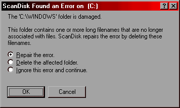
Deleting the Windows folder would seem to be a rather drastic "correction" for a missing filename association, but, hey, if anyone should know it would be Microsoft, right?
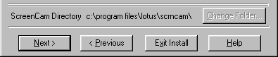
Rob Domaschuk sent in this image from the installation program for Lotus' ScreenCam. It would appear that someone at Lotus doesn't know if he's coming or going.